90 years is a long time to do anything. That's a long time to live. Heck, if you know someone who has celebrated nine decades of life, don't take that for granted. To do so is truly a blessing. We hate to be grim, but let's face it. With the decisions some of us have made about how to handle our diet and workout regimen, in many cases, it may be fair to state seeing that 90th birthday might be a more difficult benchmark to reach. Our Philadelphia Eagles don't have that problem though.
1933, the Birds were one of three franchises to join the NFL as expansion teams after being founded as a replacement for the bankrupt Frankford Yellow Jackets. The now defunct Cincinnati Reds and Pittsburgh Steelers were the other two.
The Eagles celebrated their 90th birthday on July 8th. The 2023 NFL campaign will be their 91st season of action. While we all have missed most of that, over the years, we have gotten to know players of the past and present.
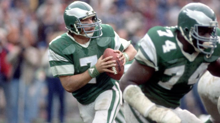
We have enjoyed great times and battled back from heartbreak, but we show up year after year regardless of what the names are on the back of the jerseys and regardless of what colors the teams are wearing. Who are we kidding though? It's going to be pretty cool to see that kelly green in 2023.
The Philadelphia Eagles logo has seen a few changes over the years.
Whether we're discussing those hideous pale blue and yellow ensembles the Eagles wore in 1933, the plain white leather helmets the Birds wore in 1935, the midnight green on white approach, or the all-black trim they rocked with black helmets three times in 2022, Philly's jersey has seen a ton of changes. There have truly been too many to remember, but they have only elected to alter the logo nine times.
Take a look. Check out the breakdown.
1933 - 1935
Upon entry into the NFL, the Philadelphia Eagles worked a lot of detail into creating their first team logo. While they would only feature this look for three seasons, this is the only logo that incorporated blue into its design.
1936 - 1942
Philly changed the blue hue of its logo to green ahead of the 1936 NFL season. Some of the detail of the Eagle was lost in the new design. The second logo in franchise history does however keep much of the same ingredients of the first. Also notice a rounder ball is being carried.
1943
With the Eagles and Steelers losing many of their players to military service during World War III, the two franchises were compelled to join forces and field a single combined team. NFL record books refer to the team as 'Phil-Pitt Combine', but many refer to them as the 'Steagles'. The latter has never been registered by league offices but still endures as a memorable moniker.
The 1943 logo was created to represent both teams. It was retired when both sides went their separate ways in 1944.
1944 - 1947
This version was the first precursor to the beloved silhouette used from 1987 to 1985. While the look wasn't perfected until more than four decades later, this is still a less-detailed but classy idea that was still revolutionary and an idea that was well ahead of its time.
1948 - 1968
Here's the logo rocked by our beloved Birds as they won three NFL Championships (1948, 1949, 1960). Think of some of the legends that we never got to see play live such as Chuck Bednarik. He won championships during two different eras and is the only Eagles to suit up for both the 1949 and 1960 squads.
1969 - 1972
The green and white color palette here is noticeable as is the now-familiar recognizable design of the 'swooping' Eagles carrying the football in its talons. This one isn't as detailed as the design that it followed (1948 until 1968), and in all honesty, that's enough to make us ask why the Eagles elected to switch things up in the first place.
1973 - 1986
The 1970s were a bad time for our Birds. Philadelphia posted a 36-72 win-loss total from 1970 until 1977 until Dick Vermeil, in his third season (1978) began righting the ship and led the Eagles to a combined mark of 20-12 in 1978 amd 1979. Then, there's the logo. It doesn't get much more bland than a picture of the team's helmet.
1987 – 1995
We know... We know... This is many of you guys' favorite. Heck, if we're being honest, this one is our favorite too. Every time we look at it we smile while reminiscing on the playing careers of everyone from Randall Cunningham and Mike Quick to Reggie White and those great defenses of the Buddy Ryan and Bud Carson years.
1996 – PRESENT
Here's the one most of you youngsters are familiar with. While we're admiring the artwork, here is some food for thought.
Have you ever noticed the Birds are the only NFL team that features a logo that faces left? The reason for that is, though some may have missed this, Swoop's beak faces left which allowed for the artist to form the letter E with the feathers at the back of his neck.
Give yourself a high-five if you knew that already. If not, be sure to pass that info along next time you're in the break room with some co-workers or you're chilling at a family function.
